Choosing the right interior paint colors goes beyond picking a shade you love—it’s about creating harmony across your space. Walls don’t exist in isolation. The paint color you select interacts with your flooring, furniture, and lighting to shape the room’s mood and style. A well-matched palette can make a room feel balanced and thoughtfully designed, while clashing tones can create visual chaos.
This guide will help you match interior paint colors with your flooring and furniture to create cohesive, welcoming interiors.
Start with What’s Fixed: Flooring First
Before you get lost in a world of paint swatches, take a good look at your floors. Whether you have hardwood, tile, carpet, or laminate, the undertones in your flooring should guide your interior paint color choices. For instance, warm-toned oak floors work beautifully with beige, cream, or soft green interior paint colors, whereas gray-toned laminate may pair better with cool blues or crisp whites.
If you’re working with dark flooring, balance the depth with lighter interior paint colors like pale taupe or soft ivory. This contrast helps a room feel more open. On the other hand, if your floors are light, you can afford to play with deeper interior paint colors like navy, forest green, or even charcoal for a dramatic effect that won’t feel heavy.
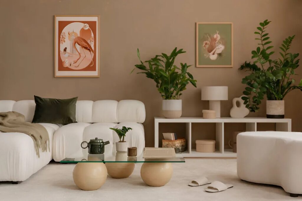
Furniture as a Color Anchor
Furniture plays a crucial role in tying the room together. Large pieces like sofas, cabinets, and beds serve as visual anchors, and your interior paint colors should complement their tones rather than compete with them. If your furniture leans neutral—think grays, whites, or creams—you have more flexibility in choosing vibrant or rich interior paint colors.
For bold-colored furniture, like a navy couch or a mustard yellow armchair, consider more muted interior paint colors to keep the space from feeling overwhelming. Soft grays, warm whites, or dusty pastels can enhance these bold elements without stealing the spotlight.
Identifying Warm vs. Cool Undertones
Understanding undertones is key to matching interior paint colors effectively. Warm undertones (yellow, red, or orange-based) pair best with other warm tones. Cool undertones (blue, green, or violet-based) work well with cool counterparts. Mixing warm and cool tones is possible but requires a strong sense of balance and a neutral middle ground—think a greige wall against both warm wood floors and cool-toned furniture.
When in doubt, look at the existing elements of your room. A walnut-stained floor likely has a warm undertone. A stainless steel dining set might signal cooler shades. Let these details guide the interior paint color palette.
Creating Flow Room to Room
While each room can have its own vibe, using complementary interior paint colors across your home helps maintain a sense of continuity. If your living room features warm neutrals, your adjacent kitchen could carry a deeper shade from the same family to create a natural transition.
One strategy for painting a room is to choose a base interior paint color for the main living spaces, then add variation by shifting the shade up or down on the same color card for adjacent rooms. This maintains cohesion while still giving each space its own identity.
Light and Shadow: How Lighting Affects Paint
Lighting can dramatically change how interior paint colors look throughout the day. Natural light highlights undertones, while artificial lighting can cast yellow or blue hues. Before finalizing your interior paint colors, test them on your walls in different lighting conditions. Paint swatches near your flooring and furniture to see how they all interact.
A color that looks creamy beige in the store could appear peachy in warm lighting or grayish in cool lighting. Observing the paint at various times of day will ensure your final choice feels consistent and flattering.
Timeless Pairings to Consider
Certain interior paint color combinations never go out of style. Classic pairings like white walls with dark hardwood floors create a clean and timeless look. Soft sage green against light oak floors evokes a calming, nature-inspired feel. Greige walls paired with black or charcoal furniture strike a perfect balance between warmth and modernity.
For those seeking a more daring approach, pairing navy or forest green interior paint colors with brass fixtures and leather furniture creates a rich, upscale aesthetic. Just be sure the flooring doesn’t clash—natural wood or stone-like tiles usually work well in these schemes.
The best interior paint colors are those that enhance your flooring and furniture rather than fight them. Think of paint as the background music of your space—subtle, cohesive, and setting the tone. By grounding your decisions in the fixed elements of your home and paying close attention to undertones and lighting, you can craft a space that feels thoughtfully designed and effortlessly beautiful.
Choose Peacock Services Home Improvement for Expert Residential Painting Services in Bradenton, FL
Ready to transform your space with perfectly matched colors? Choose Peacock Services Home Improvement for expert residential painting services in Bradenton, FL. Our team understands the art and science of pairing interior paint colors with your home’s unique flooring and furniture, delivering results that are both stylish and timeless.
Let us bring your vision to life—beautifully, professionally, and with precision. Contact us today to schedule your consultation.


